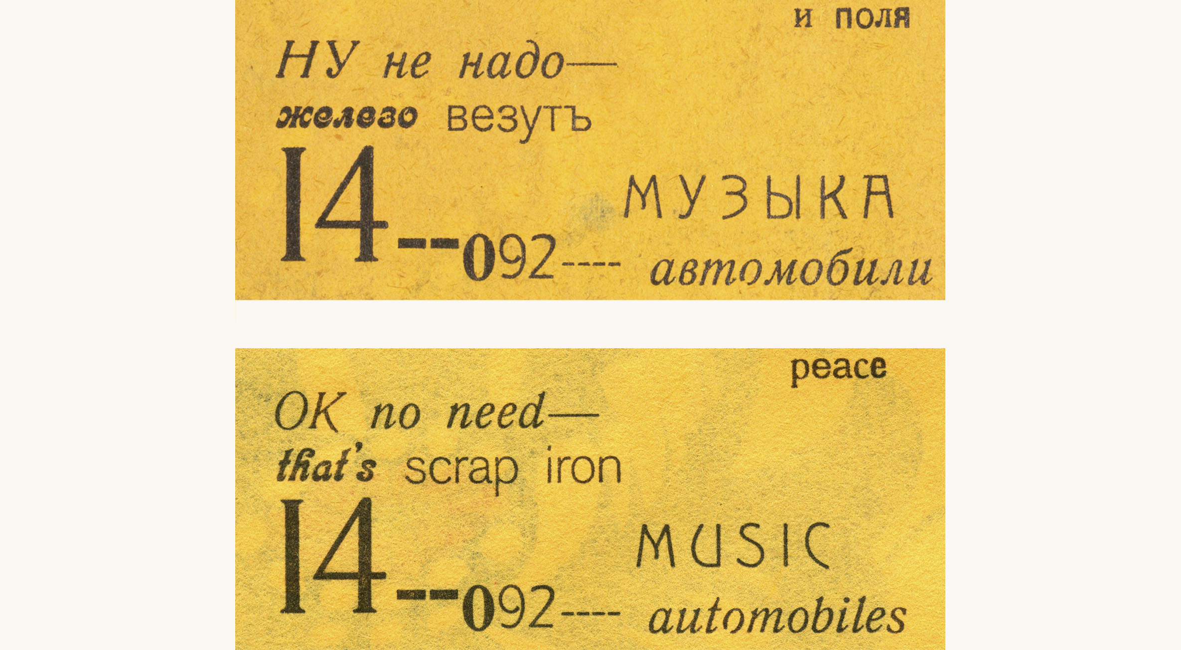
Great effort was taken to make the translation of Tango with Cows recreate the typography, design, and materiality of the original. The goal was to give to a reader of English an equivalent as possible experience as the original would give to a Russian reader.
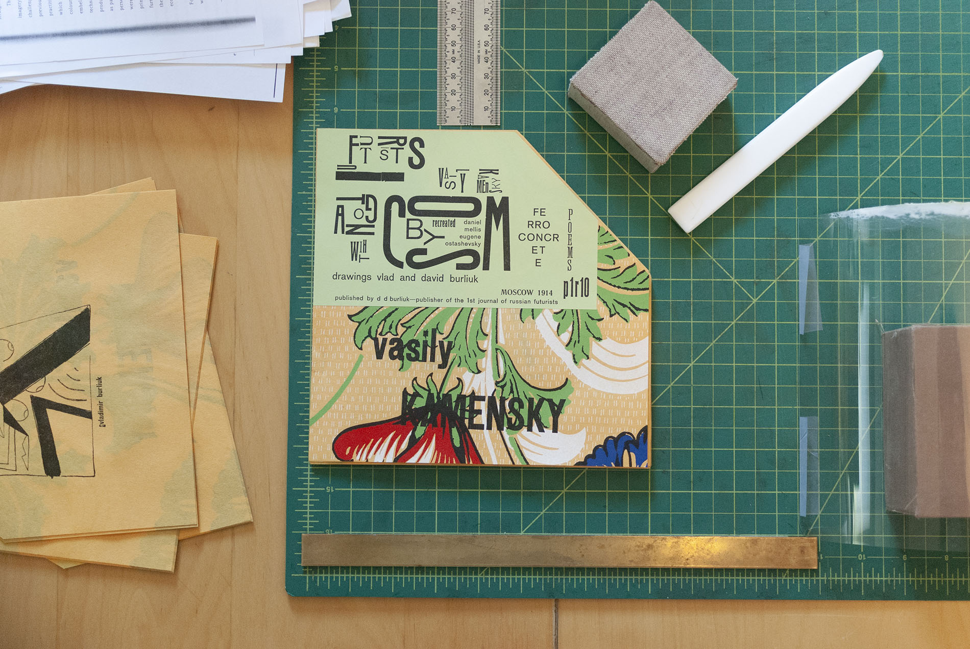
The basic substrate of the book is the wallpaper, and so it was important to replicate it as closely as possible. The original was relief printed—badly—printed from wooden rollers. The only feasible technique to replicate not only the design but also the visual texture of the bad printing was to design it digitally and then to screen print it. Modern screen printing inks match the original’s opacity, texture, and saturated colors and utilizing a semi-automated press made it practicable. The colors were precisely matched against the copies held by the Getty Research Institute and the Art Institute of Chicago and the printing idiosyncrasies in the former’s copy were recreated page for page. Ordinary paper of the required thickness is not compatible with screen printing, so custom-made Japanese paper was ordered to match the color and weight of the original; the high percentage of kozo fibers in the paper greatly adds to its stability during printing.
Although Tango with Cows was printed from handset metal and wood type, the translation was designed on a computer and printed from photopolymer plates. This choice was made to prioritize the appearance of the letterforms over the technology of typesetting. Perhaps when metal type was still a commercial medium it would have been possible to match the design with moveable type, but in the twenty-first century it was necessary to prioritize visual appearance over process.
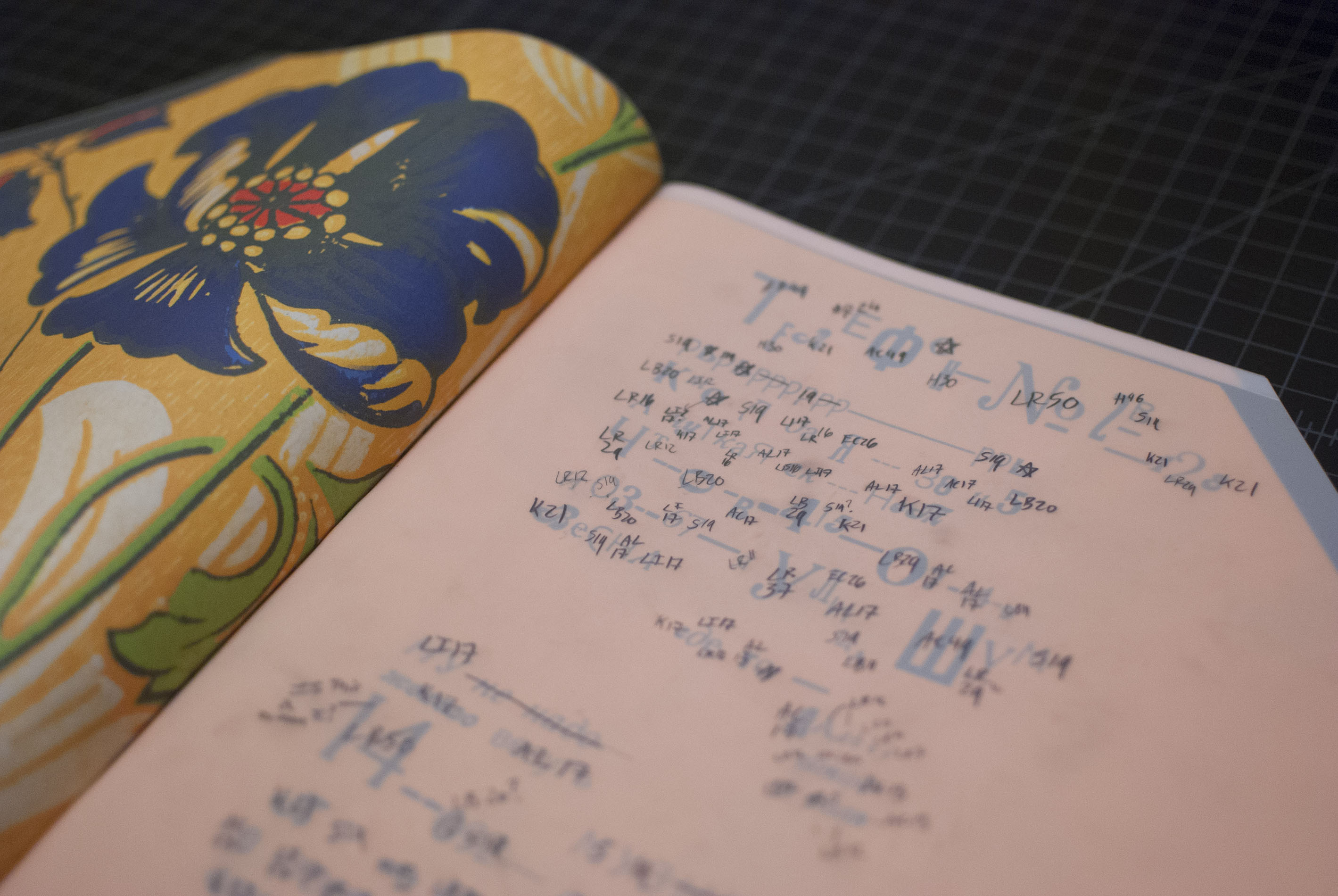
Once the decision was made to design the translation digitally, the process was relatively straightforward although extremely labor intensive. First, the over 5,000 letterforms in the book were digitally sorted by size and style, then this classification was transferred back to an oversized facsimile, and finally entered into InDesign. Next, the typefaces were identified and exact Latin equivalents to the Cyrillic were located in late nineteenth and early twentieth century type specimen books. Digital fonts were then either found, extensively modified, or created from scratch in order to match their metal antecedents as closely as possible. Up to seven fonts for each typeface style were used in order to take into account significant variations of design, proportion, and weight in the different sizes of the metal and wood originals.
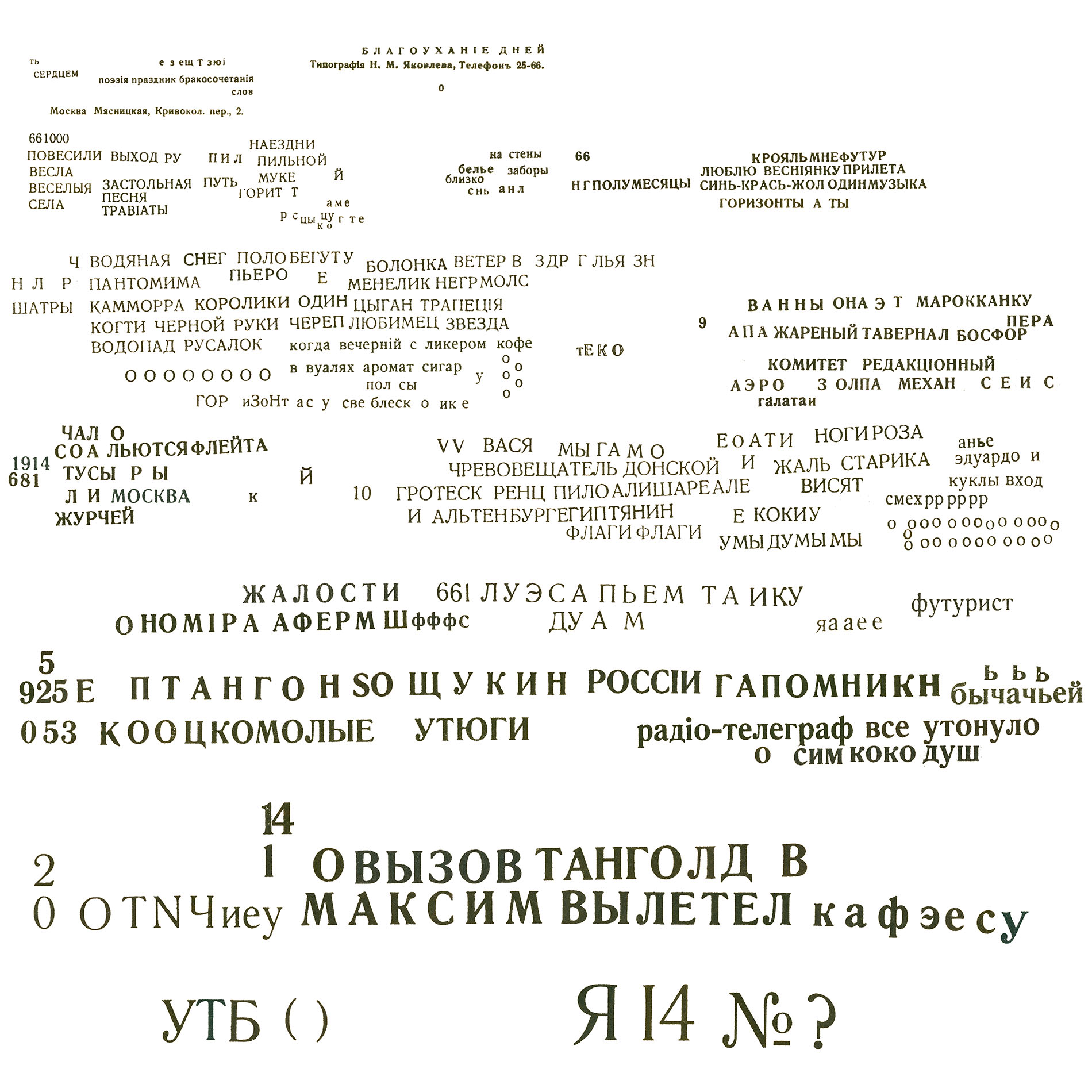
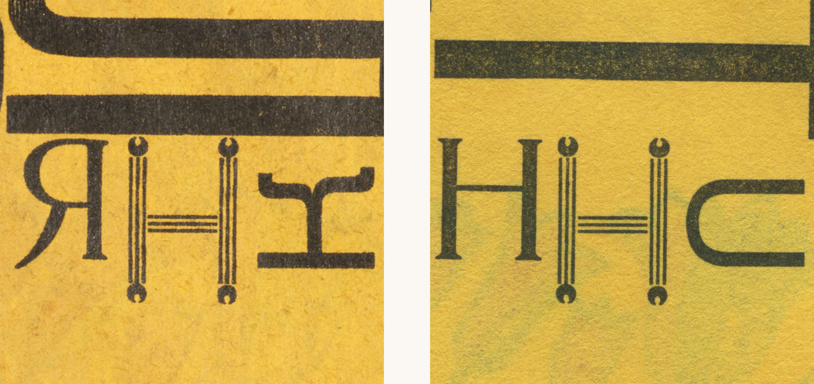
The typesetting of the book took place concurrently with the linguistic translation as it needed to fit within the visual constraints of the original. This proved easier than expected even though English and Russian have important differences both in grammar and average sentence length. One especially fortuitous coincidence was that the Cyrillic ‘H’ on the back page constructed from rule and ornament could be reused for a Latin ‘H’. Once the translation was complete, the typesetting was refined to move away from the insistent regularity that is the default of digital design. Careful attention was paid to letter and word spacing, the orientation of every word, and damage to individual pieces of type.
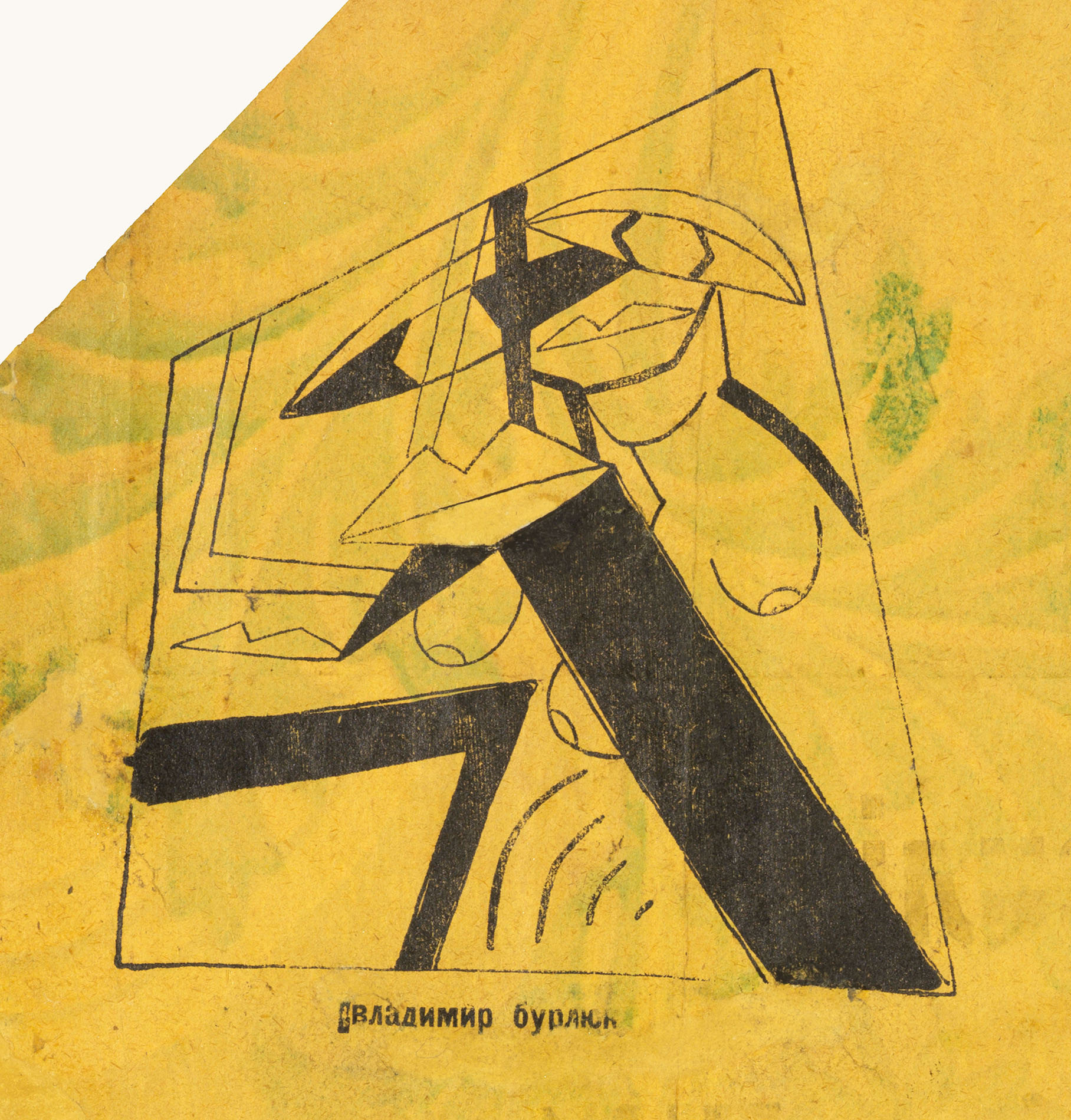
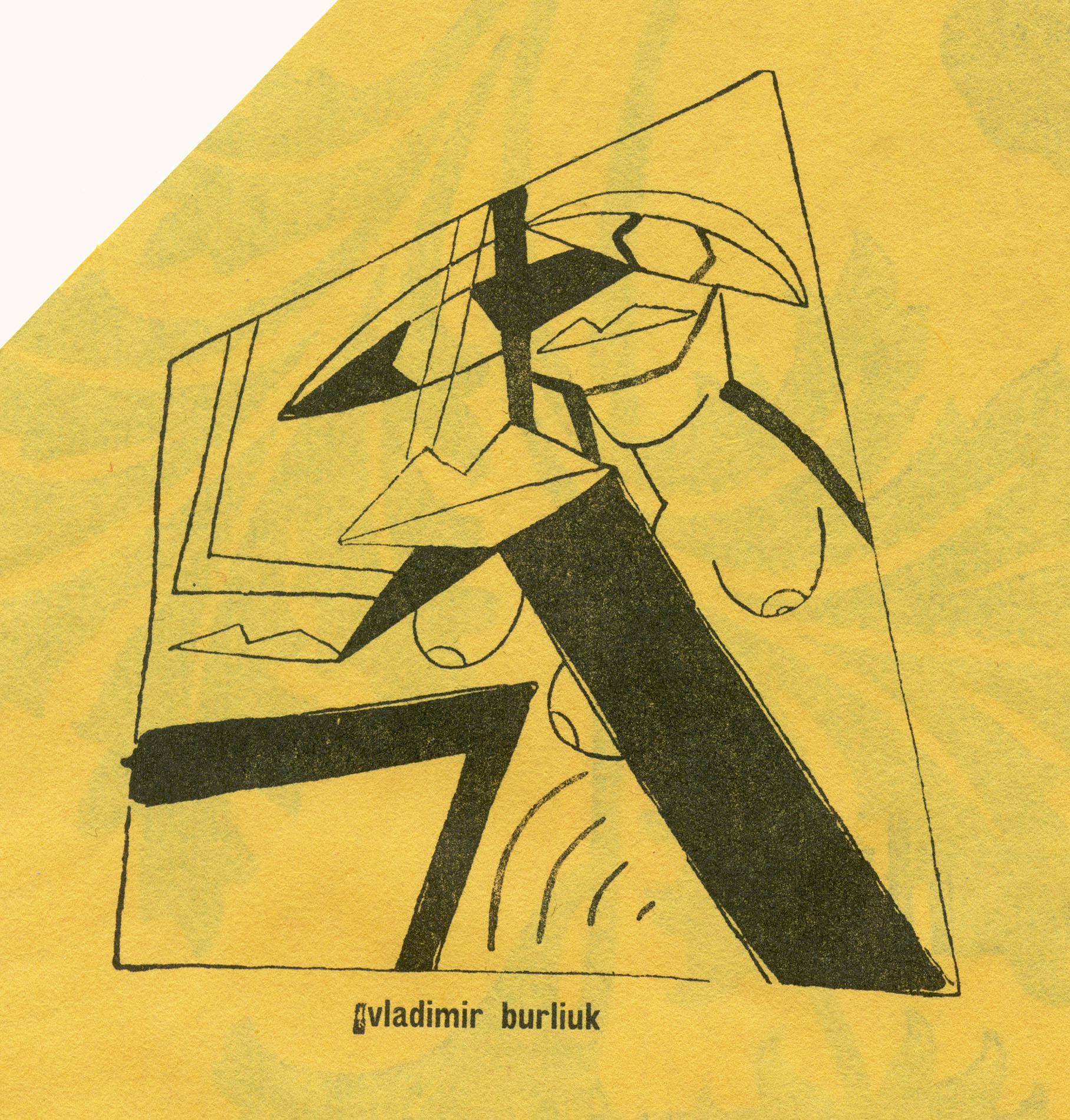
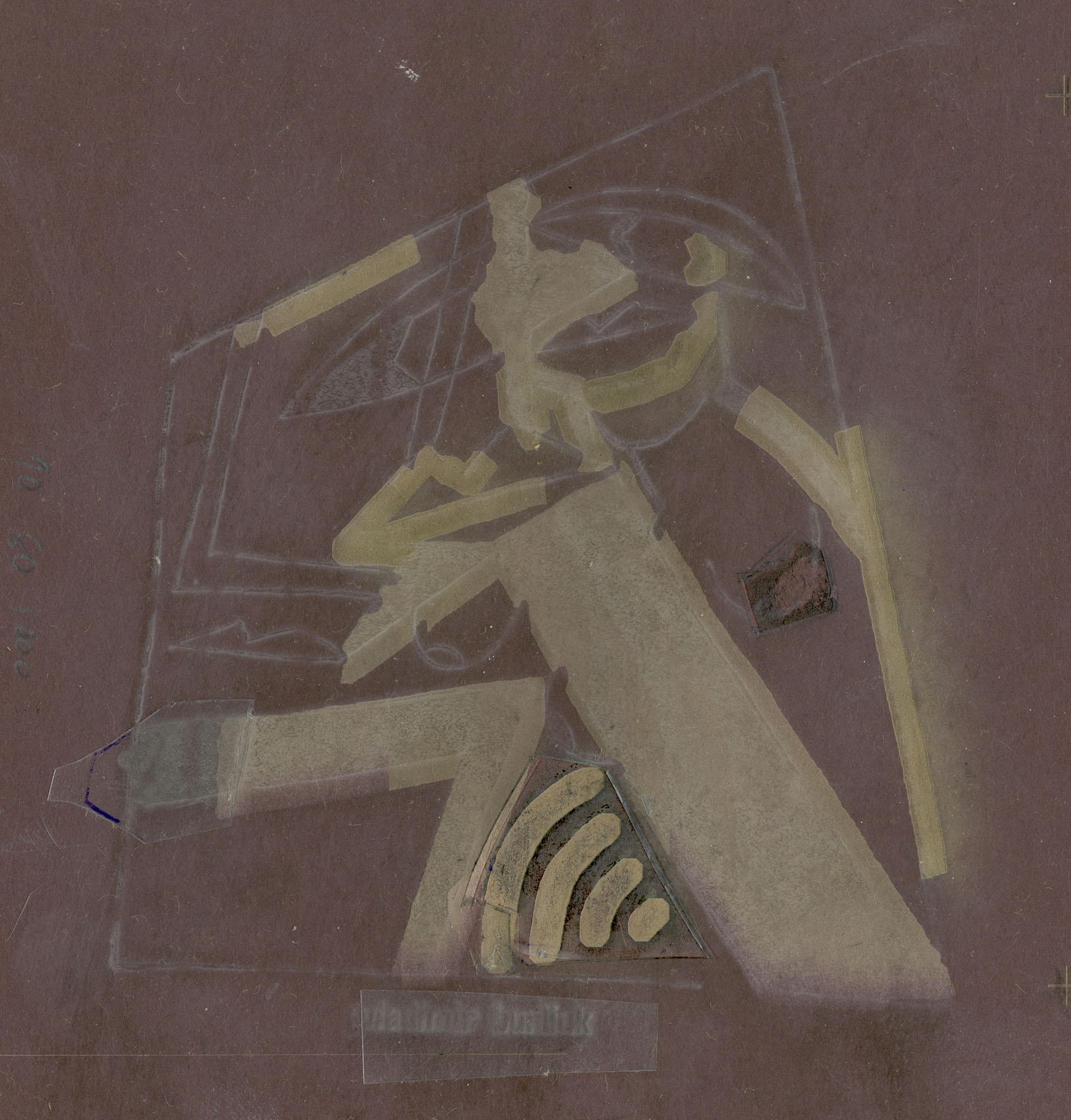
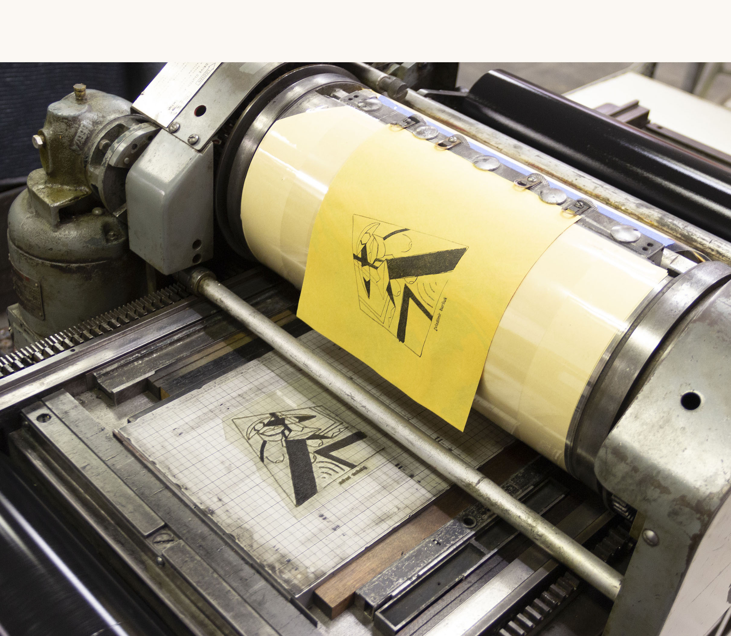
Printing the translation letterpress allowed for the translation to have the same subtle textures of the original. A custom black ink was mixed and careful presswork was done to match the color and weight of the original letterforms. Weak printing in the original was matched using makeready to vary the pressure below specific areas of each page. For the three illustrations, which have weak printing of different degrees in contiguous areas, paper for makeready was etched to three different depths using a laser cutter.
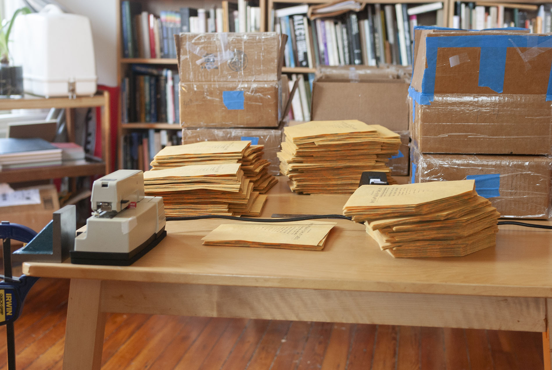
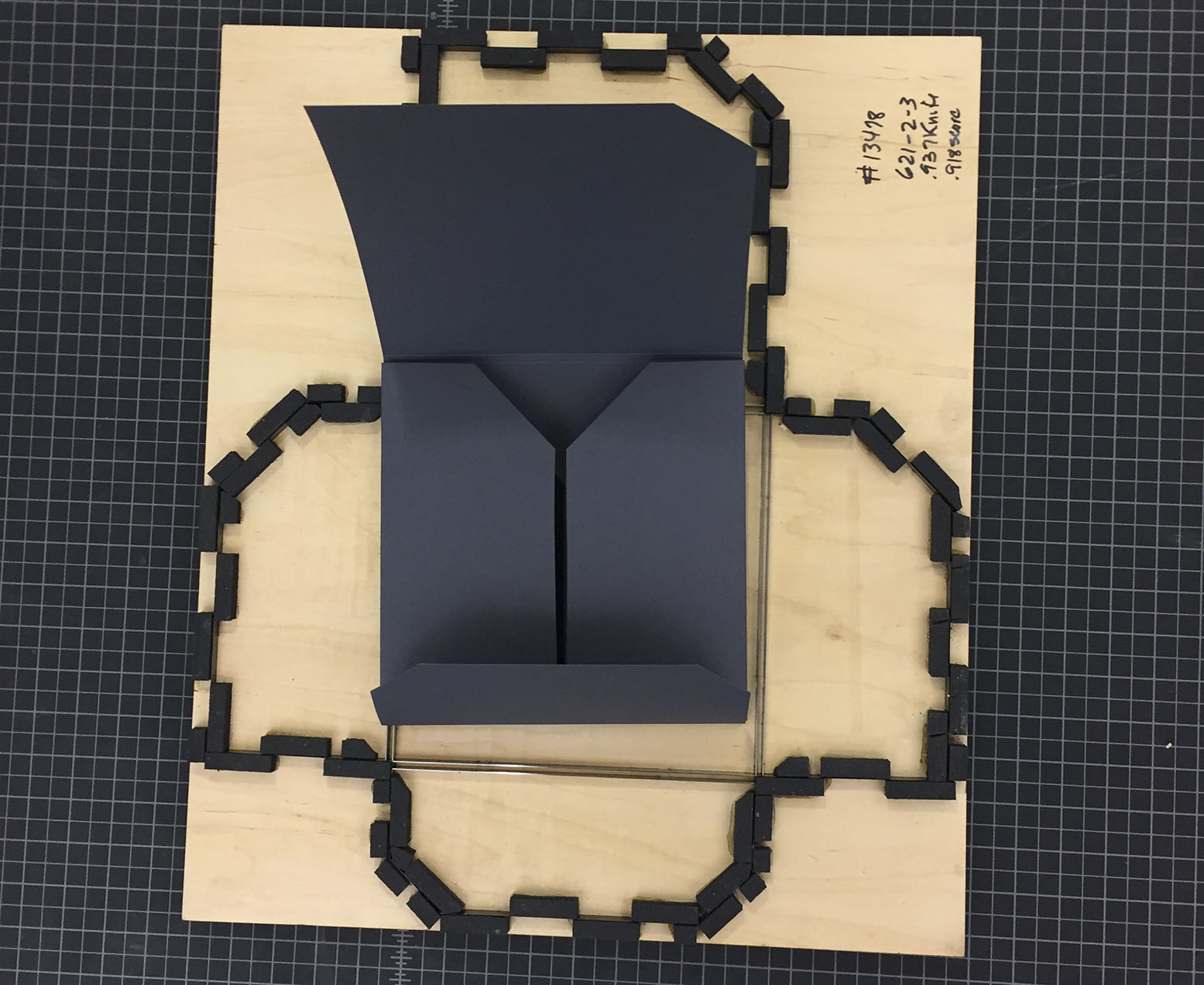
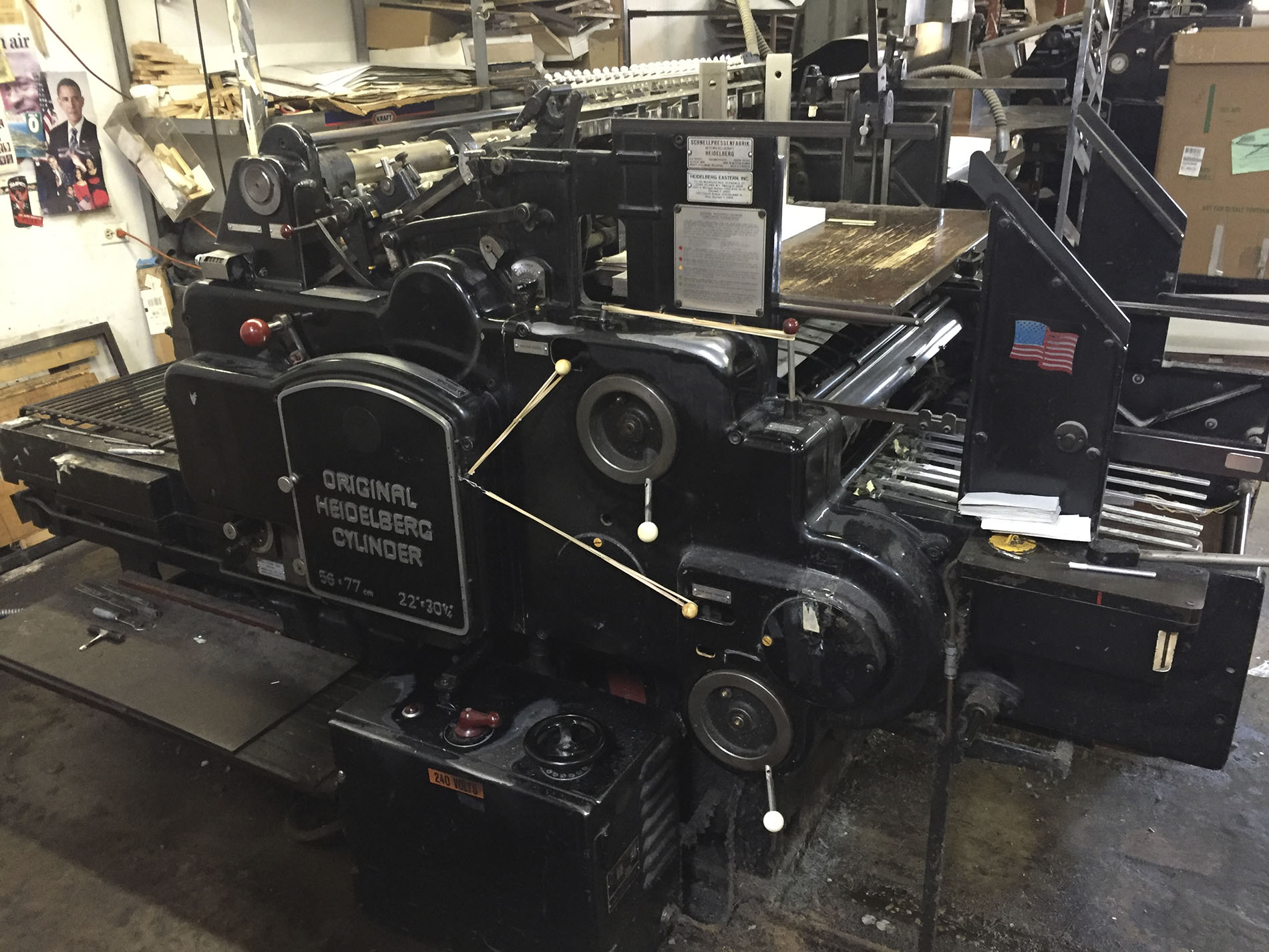
Fortunately, the binding of the original was simple and easy to replicate. After trimming each page to match the Getty's copy and affixing the label to the front cover, the sixteen interior pages were collated and stapled twice and the two covers glued on. The staples are monel, a cupronickel alloy to avoid corrosion. The portfolio envelopes that house the translation, facsimile, and additional portfolio were die cut on a Heidelberg cylinder press.